OVERVIEW
Product
Tomo is an exclusively Task Management SaaS Web Templates UI Kit, meticulously crafted with Figma. This template is not just another web design, it's a comprehensive solution for developers and designers aiming to build top-tier Task Management SaaS websites with ease.
Tomo leverages all Figma features, including design system, typography, iconography, auto layout, variables, dynamic components & variants. You can use our set vector UI kit symbols to build your product design. All symbols and objects are vector-based and easily editable.
Role
UI/UX Designer
Timeline
1 Bulan
Link Sales 1
UI8
Link Sales 2
Gumroad
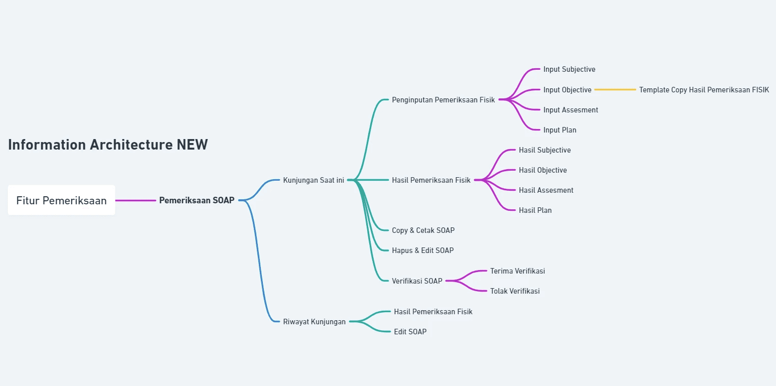
There are 2 goals that I focus on in improving this Inspection Feature, including
User
In terms of appearance/User, I want to :
Make it easier for users to use the examination features
Make it easier for users to read patient information.
Provide users with a good experience with the examination features.
Business
In terms of business with the new look, I want to :
Increase the efficiency of medical personnel
Speed up hospital services
Reduce complaints from hospitals
MedMinutes has a main feature, namely Patient Examination. However, based on the problem, there are several problems that are often experienced by medical personnel, including:
“On the visit information display, the patient data provided is incomplete”
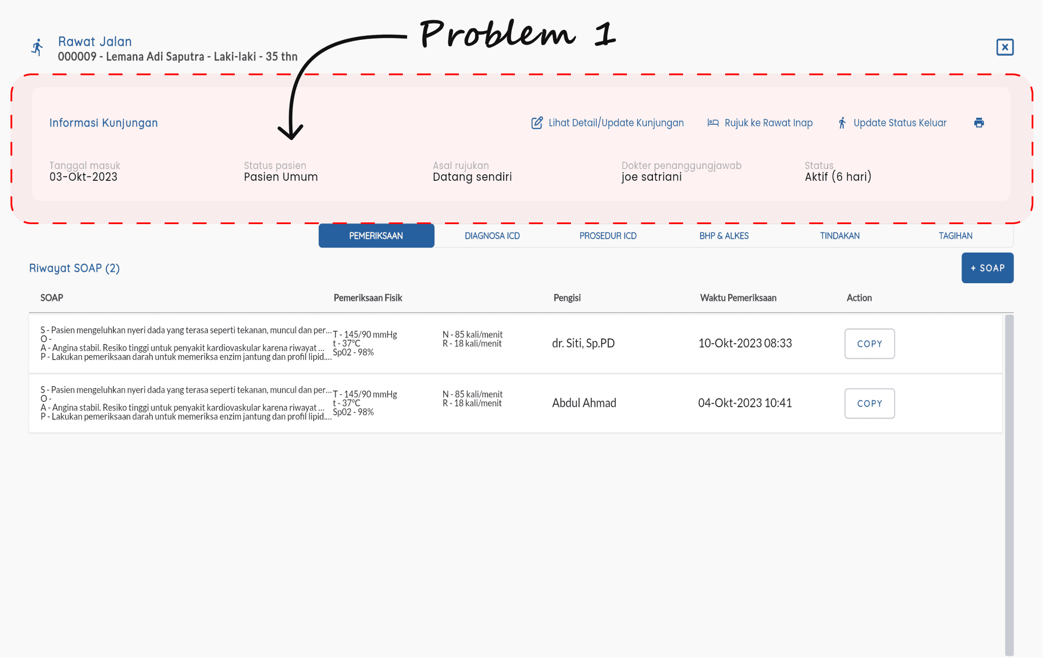
“On the data entry display, the layout is too narrow and users have difficulty inputting data, especially SOAP.”
“On the SOAP display, the examination results are difficult to read.”
I conducted Usability Testing at 1 Hospital (2 Doctors and 5 Nurses) and when conducting validation they stated difficulties.
This raised questions and I found a number of user pain points, and I focused on 3 problematic features, namely Patient Visit Information, Patient Data Examination Input, Examination Result Information.
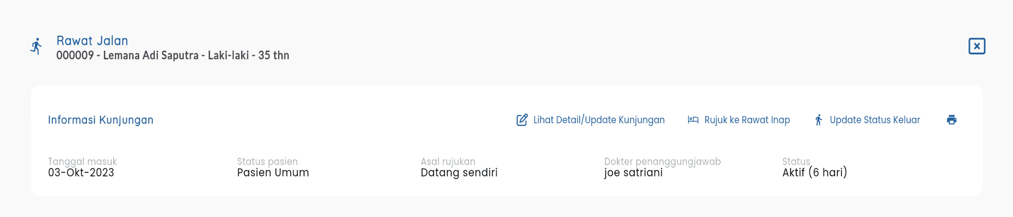
*Visiting Information
“...In the Patient Visit information, is there anything that needs to be added regarding patient information?”
Lack of patient visit information provided.
No printed medical record labels for patient documents.
No examination time for evaluating doctor performance.
No BPJS claim indication feature for Hospital integration
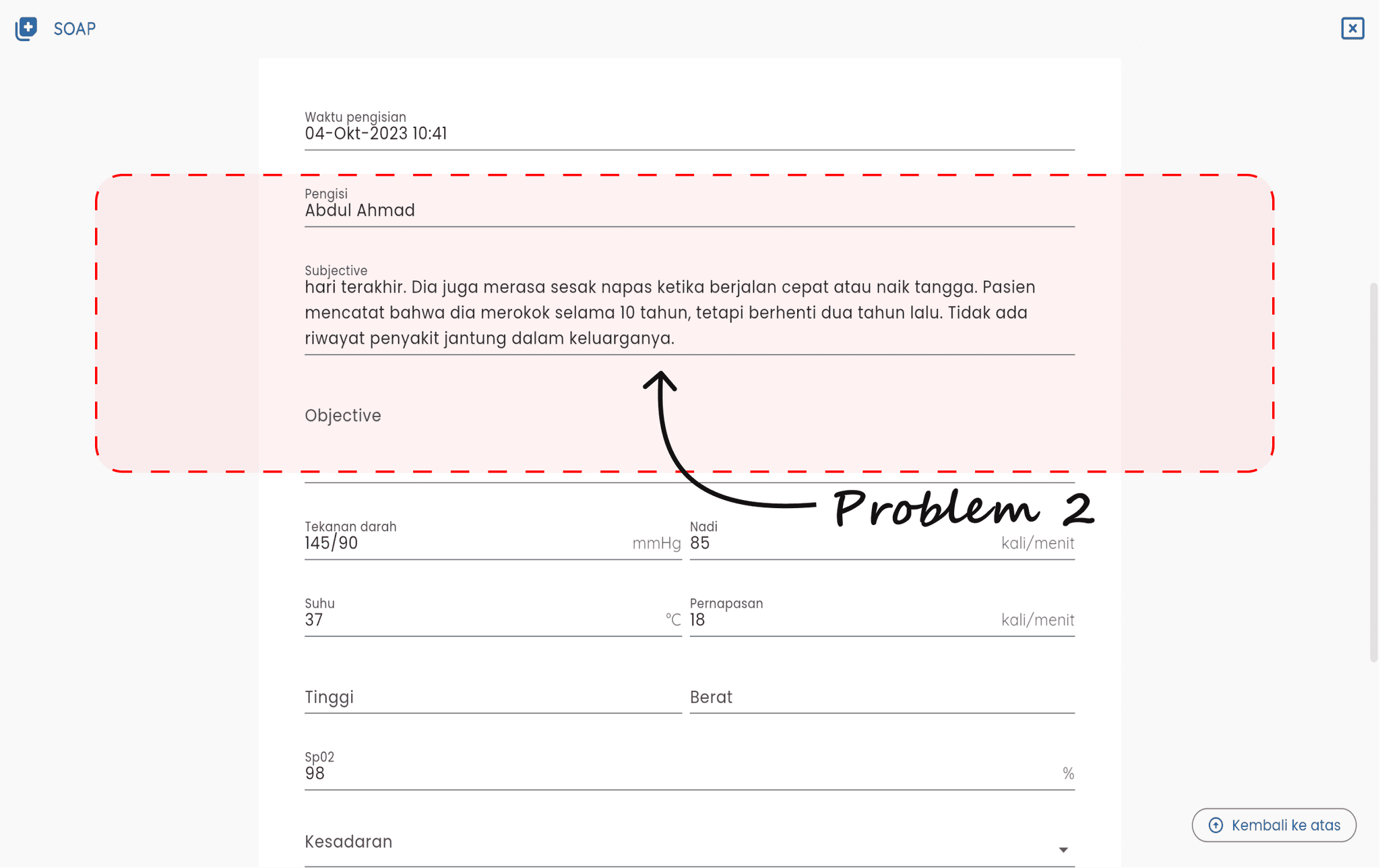
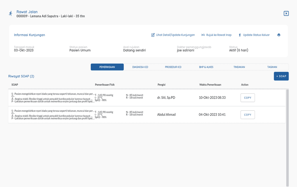
*Inputting Patient Data Examination
“...Is the inputting of patient data good and fast in filling?”
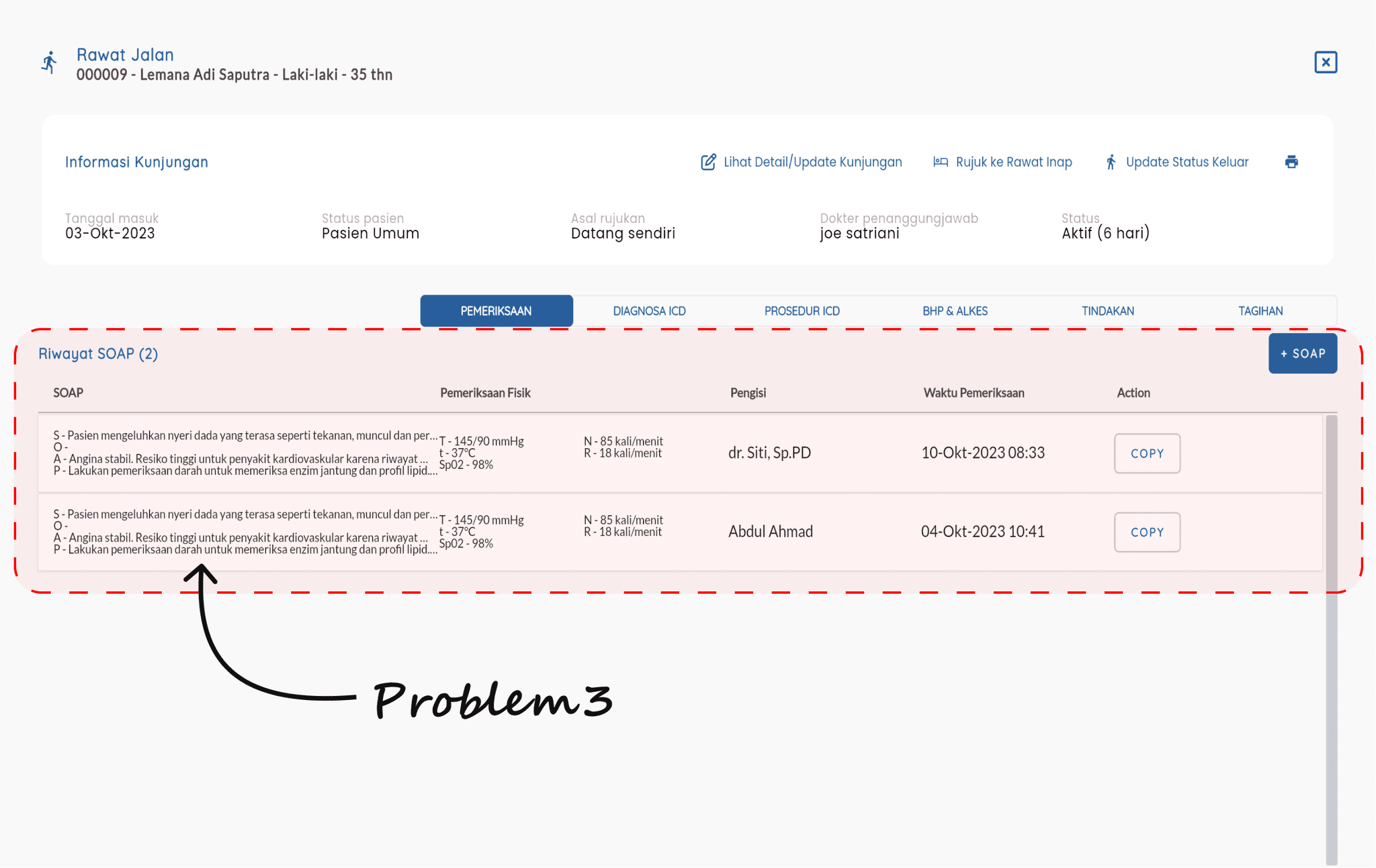
Users have difficulty in filling in SOAP (Subjective, Objective, Assessment and Plan) which is actually narrower when inputted and difficult to read.
Users feel good in filling in the PHYSICAL Examination input but cannot be fast because it is still manual in inputting.
*Examination Result Information
“...In displaying the examination results, is it easy for medical personnel to read the results?”
All users have difficulty reading the examination results (PHYSICAL or SOAP).
Some users do not find the patient examination history feature.
Some users have difficulty in knowing the high and low indications of the PHYSICAL examination results.
After analyzing the problem (Hypothesis) and conducting validation, it is proven that:
Users have difficulty in finding Patient Information
Users have difficulty in inputting examination data
Users have difficulty in reading examination results.
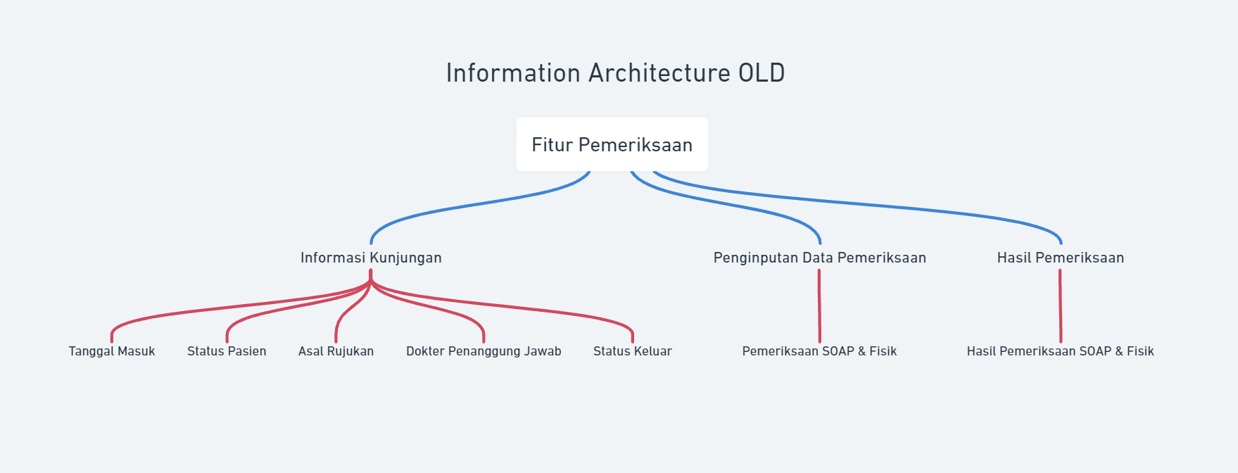
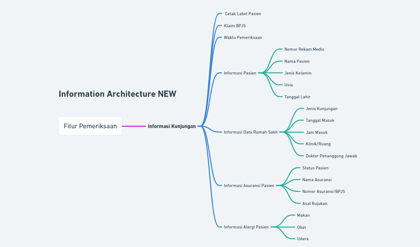
I made an update to the new Information Architecture, because of the many new discoveries from Pain Points and also there is additional and changing information in terms of placement.
“HMW makes users feel confident that they have all the information they need?”
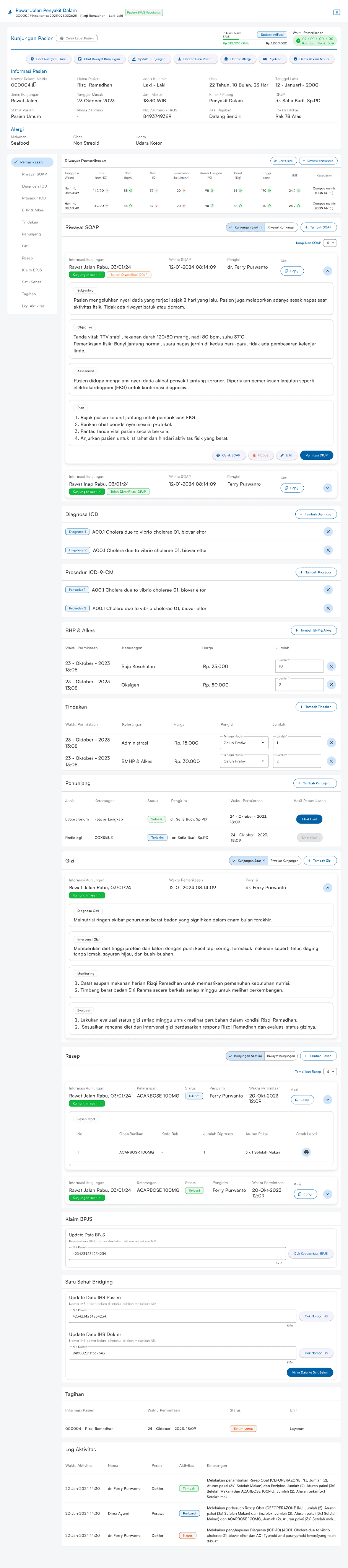
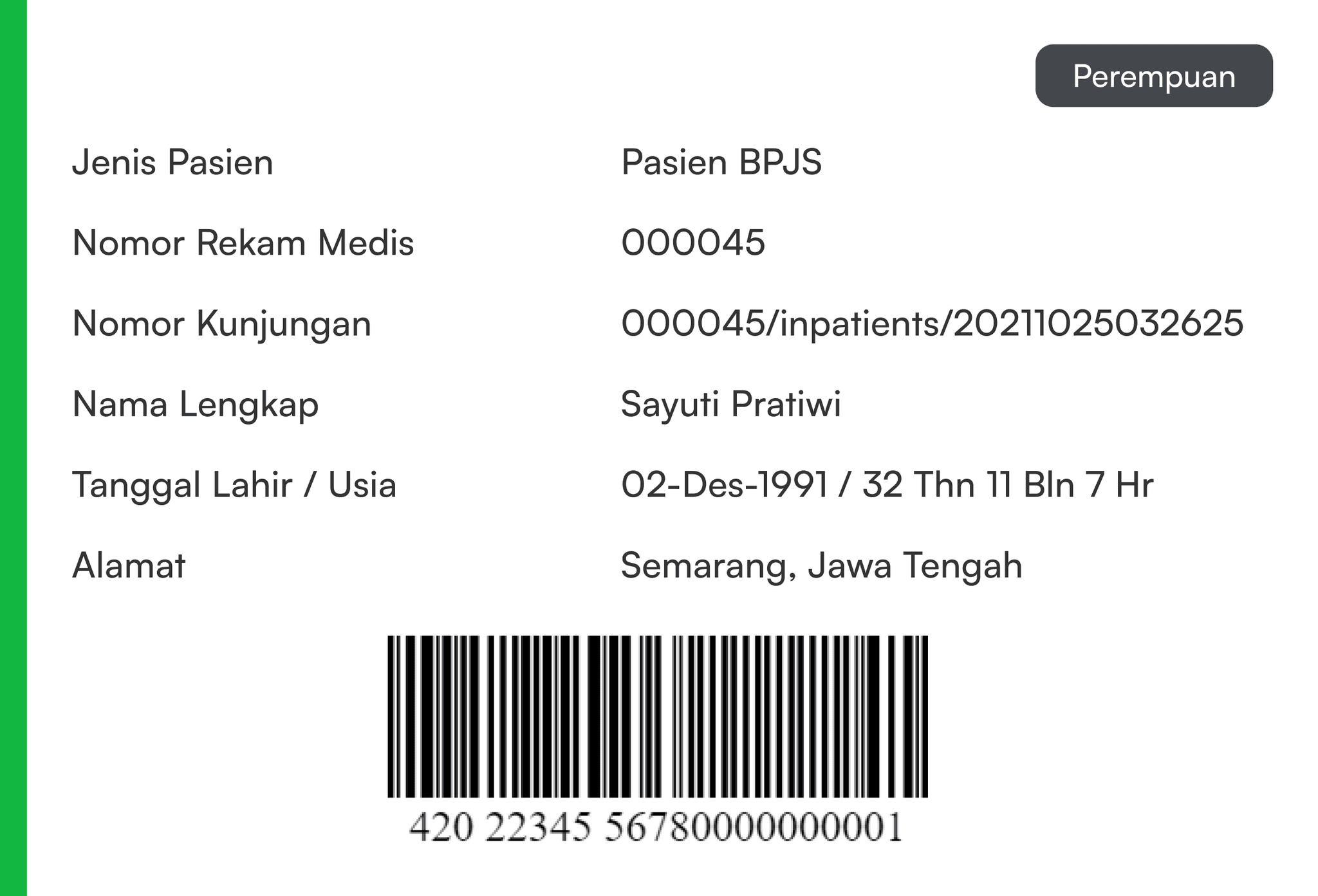
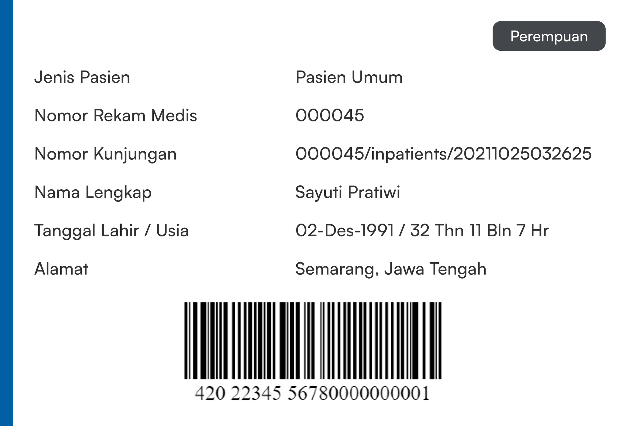
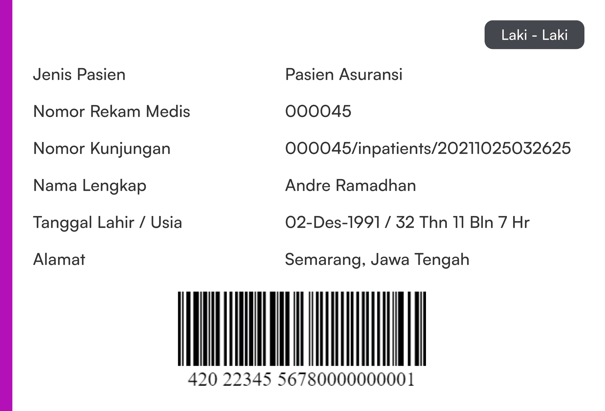
To create complete Visit Information, I discussed with Stakeholders and read BPJS documentation to compile Visit Information that meets Hospital standards. This information makes it easier for Medical Personnel by providing complete patient data.
First Line (Patient Information)
Medical Record Number
Patient Name
Gender
Age
Date of Birth
Second Line (Hospital Data Information)
Visit Type
Admission Date
Admission Time
Clinic / Room
DPJP
Third Line (Insurance Information)
Patient Status
Insurance Name
Insurance Number / BPJS
Referral Origin
File Location
Fourth Line (Patient Allergy Information)
Food
Medication
Air
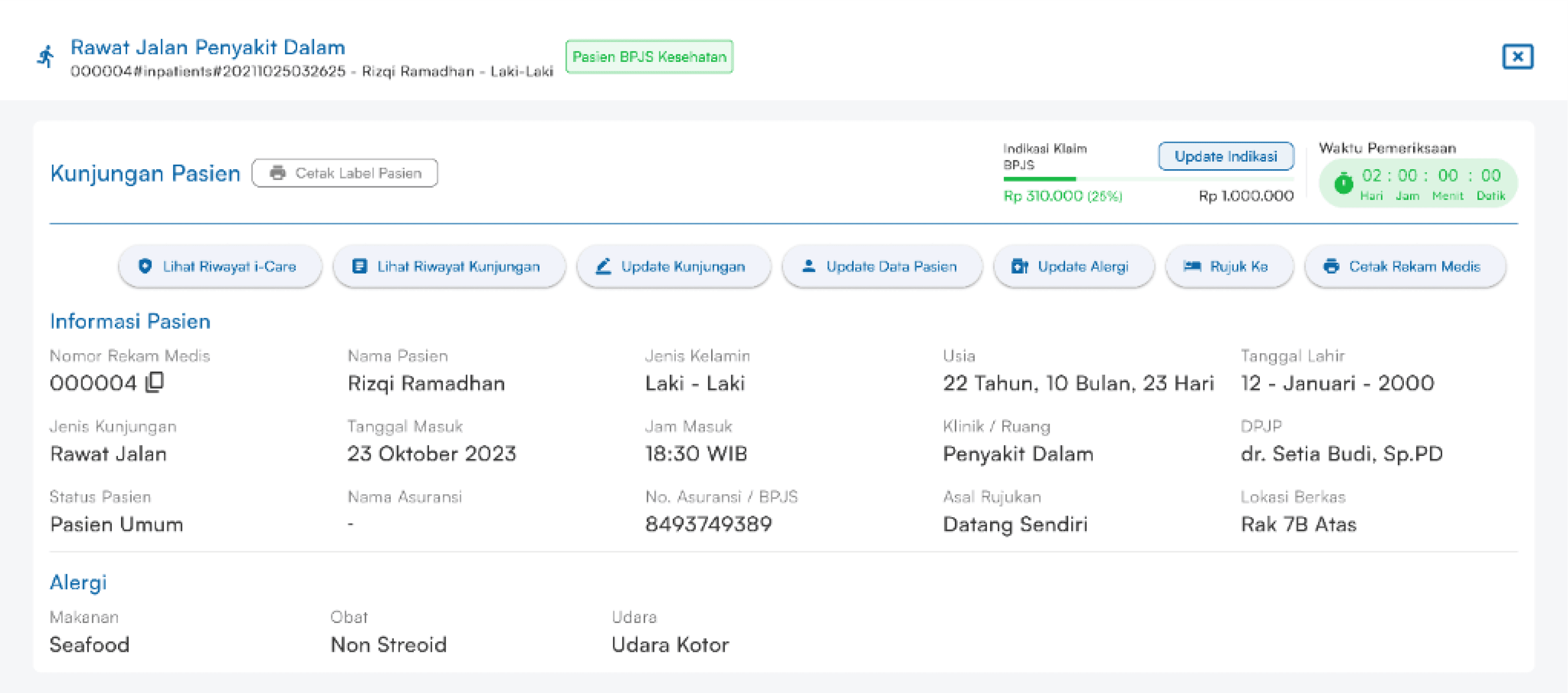
“HMW ensures that the printed labels meet user needs?”
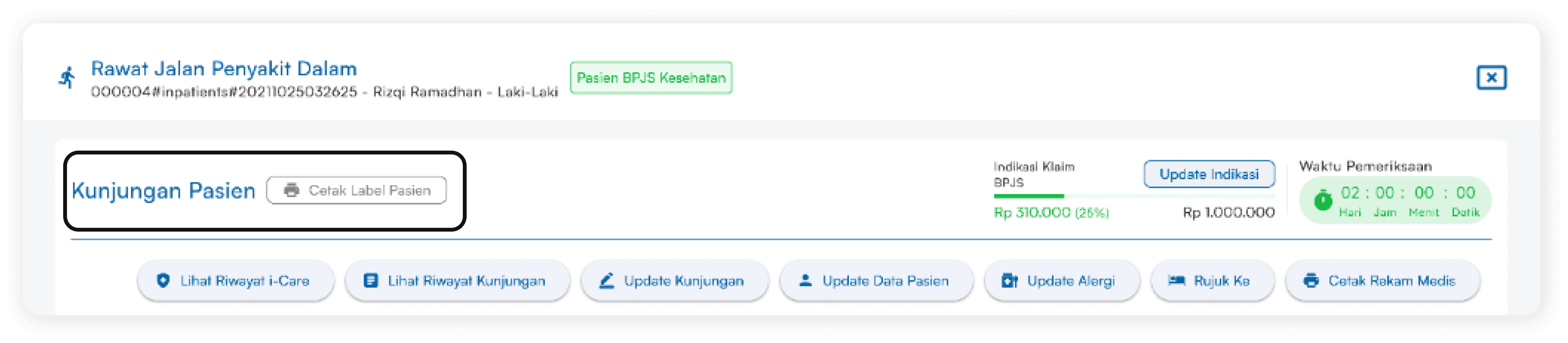
In the Visit Information header display, I also added the Print Patient Label feature which functions to make it easier for the medical team to create labels on paper documents.
I created 3 different types of patient labels according to Patient Type, namely Green (BPJS), Blue (General), Purple (Insurance).
“HMW conveys information related to BPJS and examination times clearly and in an integrated manner in the examination process?”
I created 3 types of BPJS Claim Indications. Its function is to monitor the use of BPJS amounts and BPJS Integration in SIMRS and also assist in Hospital Accreditation.
I created 3 different types of Examination Time, namely Green, Yellow, Red, which function for doctors to see how long they serve patients and also function to evaluate doctors whether they serve patients quickly or slowly.
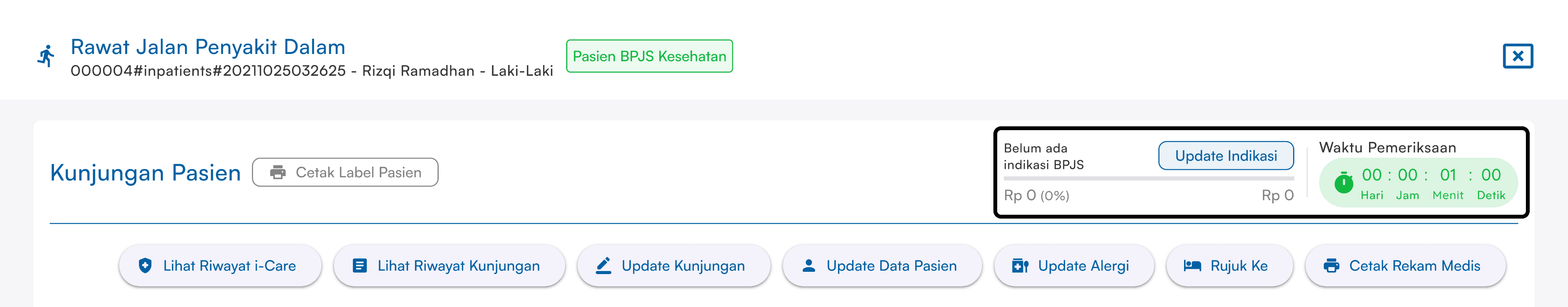
“On the BPJS Claim display, the Gray color indicates (BPJS has not been indicated).”
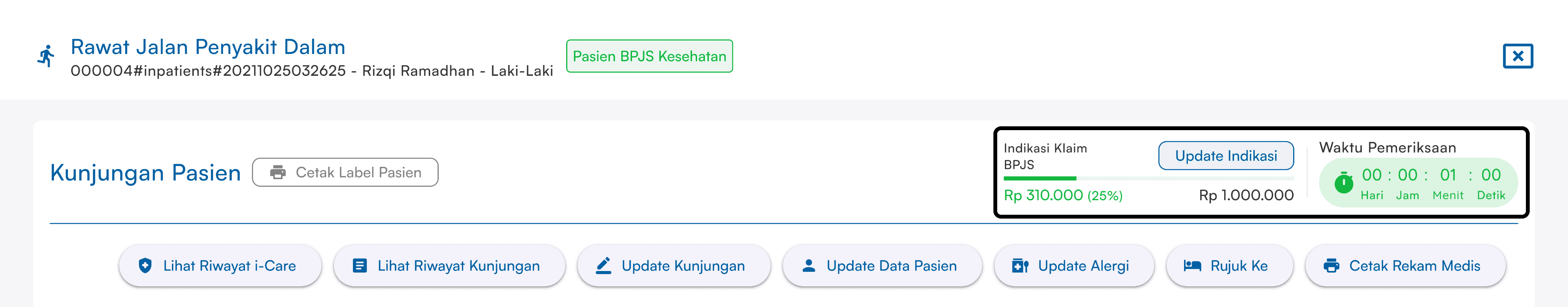
“On the BPJS Claim display, the Green color indicates (BPJS used 25%).”
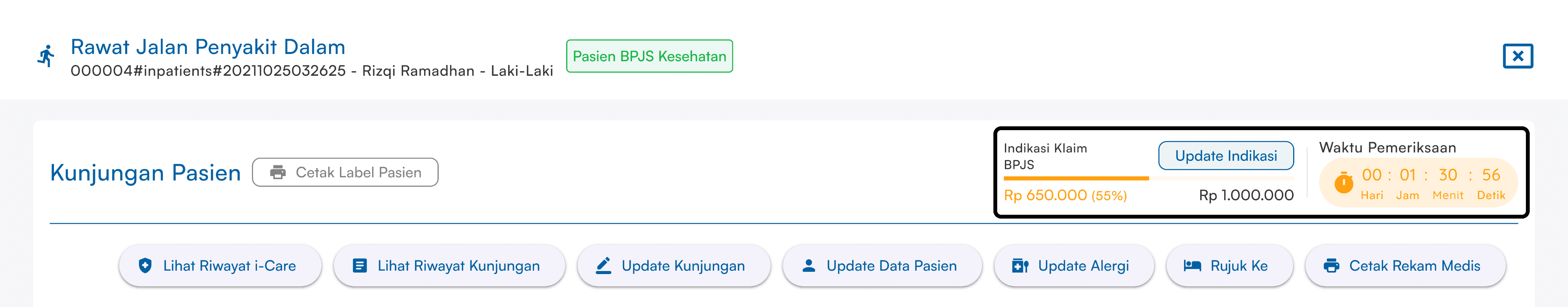
“On the BPJS Claim display, the Yellow color indicates (BPJS used 55%).”
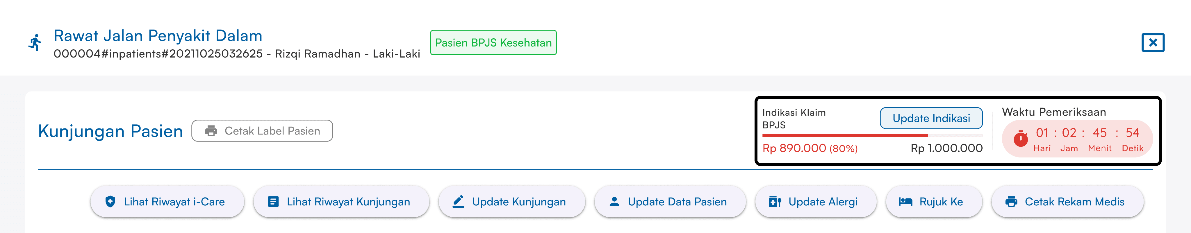
“On the BPJS Claim display, the Red color indicates (BPJS used above 80%).”
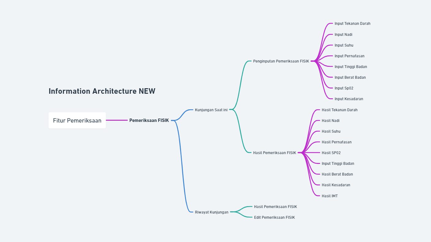
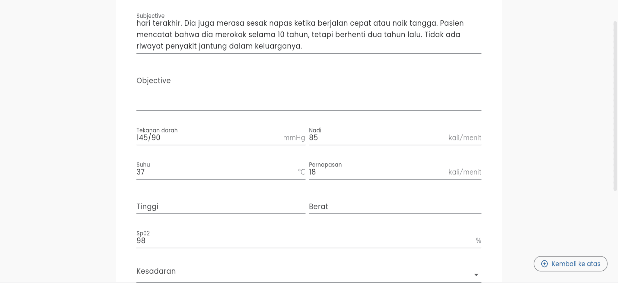
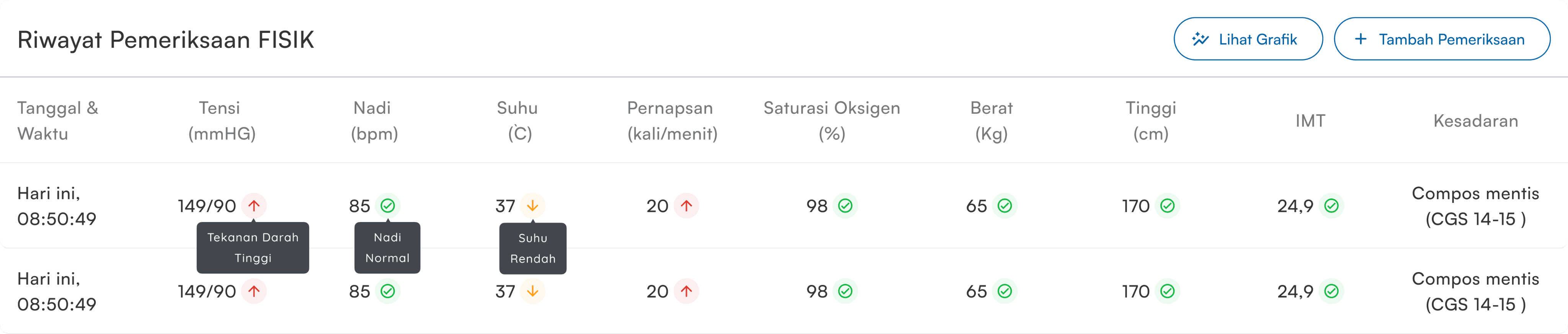
Physical examination is a patient examination consisting of blood pressure, pulse, temperature, breathing, height and weight, oxygen saturation (Sp02), consciousness.
“HMW makes the patient data input process fast and intuitive?”
Inputting and information on the results of the new PHYSICAL Examination, I made the input separate from the SOAP Examination.
The function of separating the PHYSICAL examination and the SOAP Examination allows medical personnel to focus on different aspects of patient care.
In the design I also made a choice of PHYSICAL examination result numbers in each input.
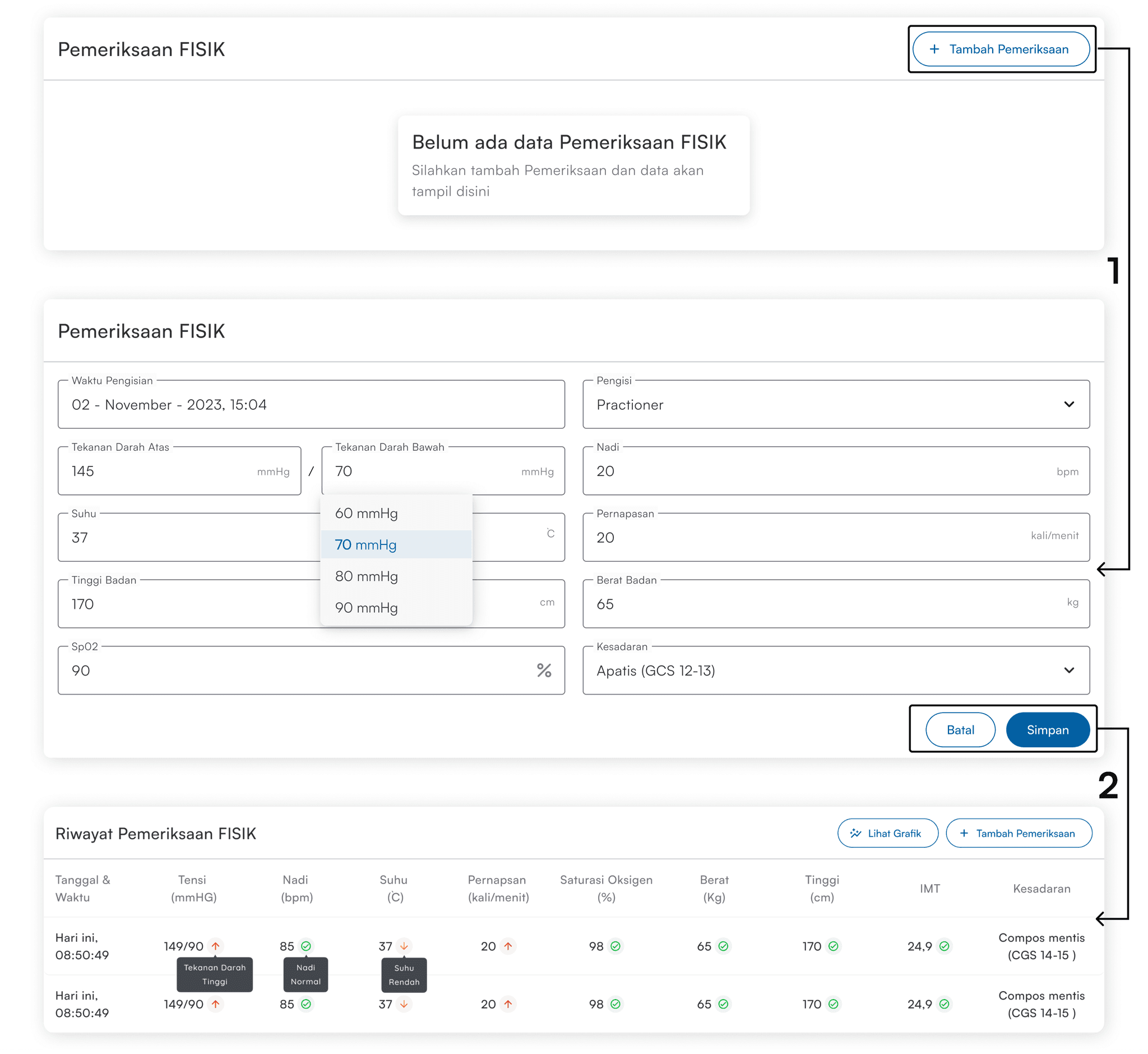
"On this display, the user must click the + Examination button to perform input"
"On this display, the user can select the examination number to make input easier and faster"
"On this display, the user has performed the Examination and displays the PHYSICAL Examination Results which are easy to read"
“HMW helps and provides clear and easy to understand examination indication information?”
The function of having Physical indications and BMI indications is that every time a Nurse or Doctor performs an examination, they will see the High (Red), Normal (Green), and Low (Yellow) indicators and make it easier for Medical Personnel to see the results of the examination that has been carried out.
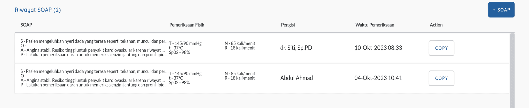
A SOAP examination is a record of the patient's subjective information, objective findings from the physical examination, the physician's medical assessment, and any recommended treatment or follow-up plan.
“HMW makes it easy for users to input and read examination results?”
Similar to the PHYSICAL examination, I made the input and information of the results of the new SOAP Examination separate.
I also made the SOAP examination results display vertical to make it easier for doctors to read the results.
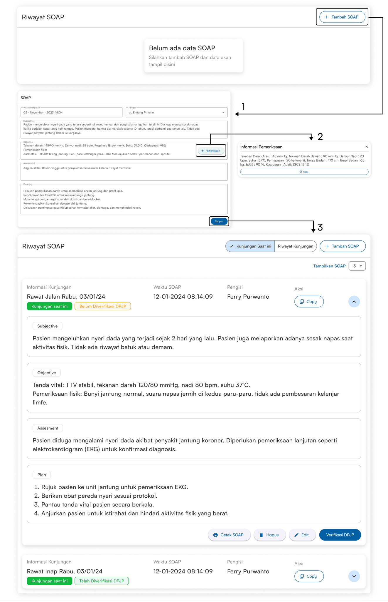
"In this flow display, the user must click the +SOAP button to make input"
"In this flow display, the user can make input and take the results of the Physical Examination on the +Examination button"
"In the display, the user can input SOAP results easily and clearly"
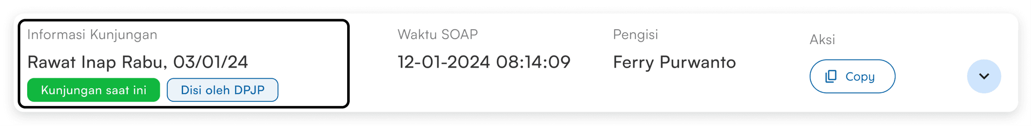
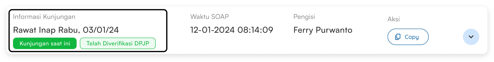
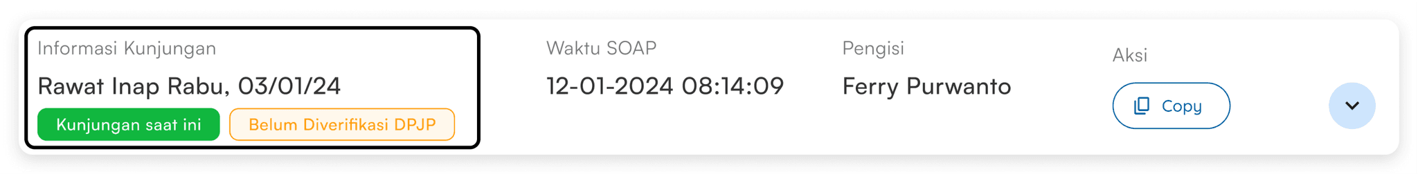
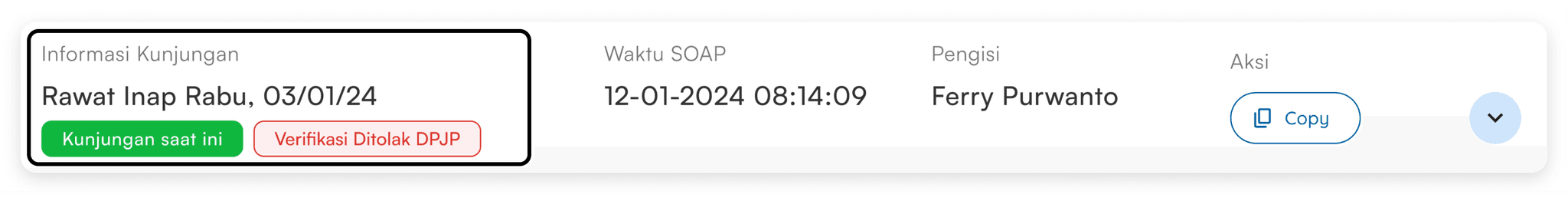
The function of DPJP Verification is to show that the SOAP examination has been evaluated or approved by the responsible doctor and the patient can continue treatment.
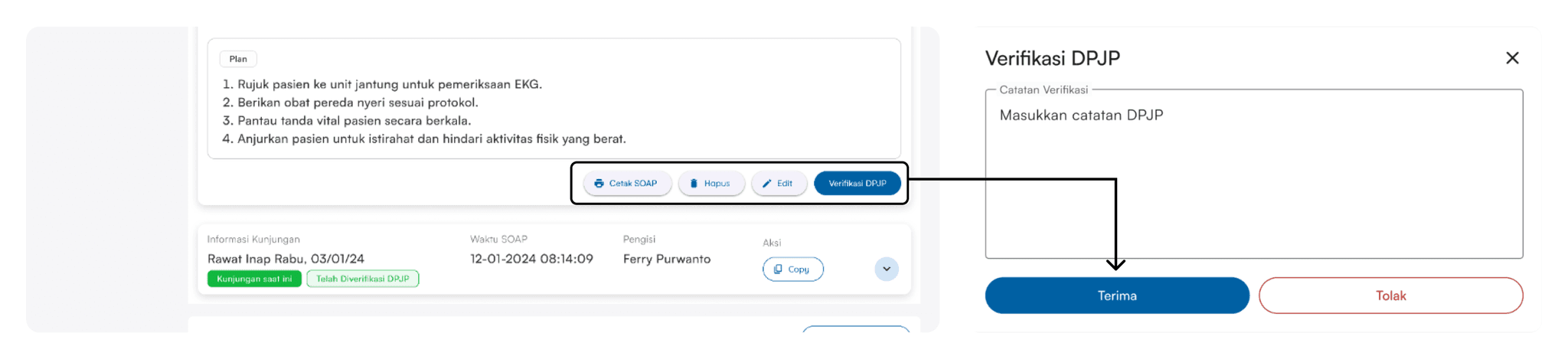
Label Design After DPJP Verification
“The blue Labels display indicates that the SOAP was filled in directly by the Doctor in Charge”
“The green Labels display indicates that the SOAP has been verified by the Doctor in Charge”
“The yellow Labels display indicates that the SOAP has not been verified by the Doctor in Charge”
“The red Labels display indicates that the SOAP was rejected by the Doctor in Charge and needs to be reviewed again”
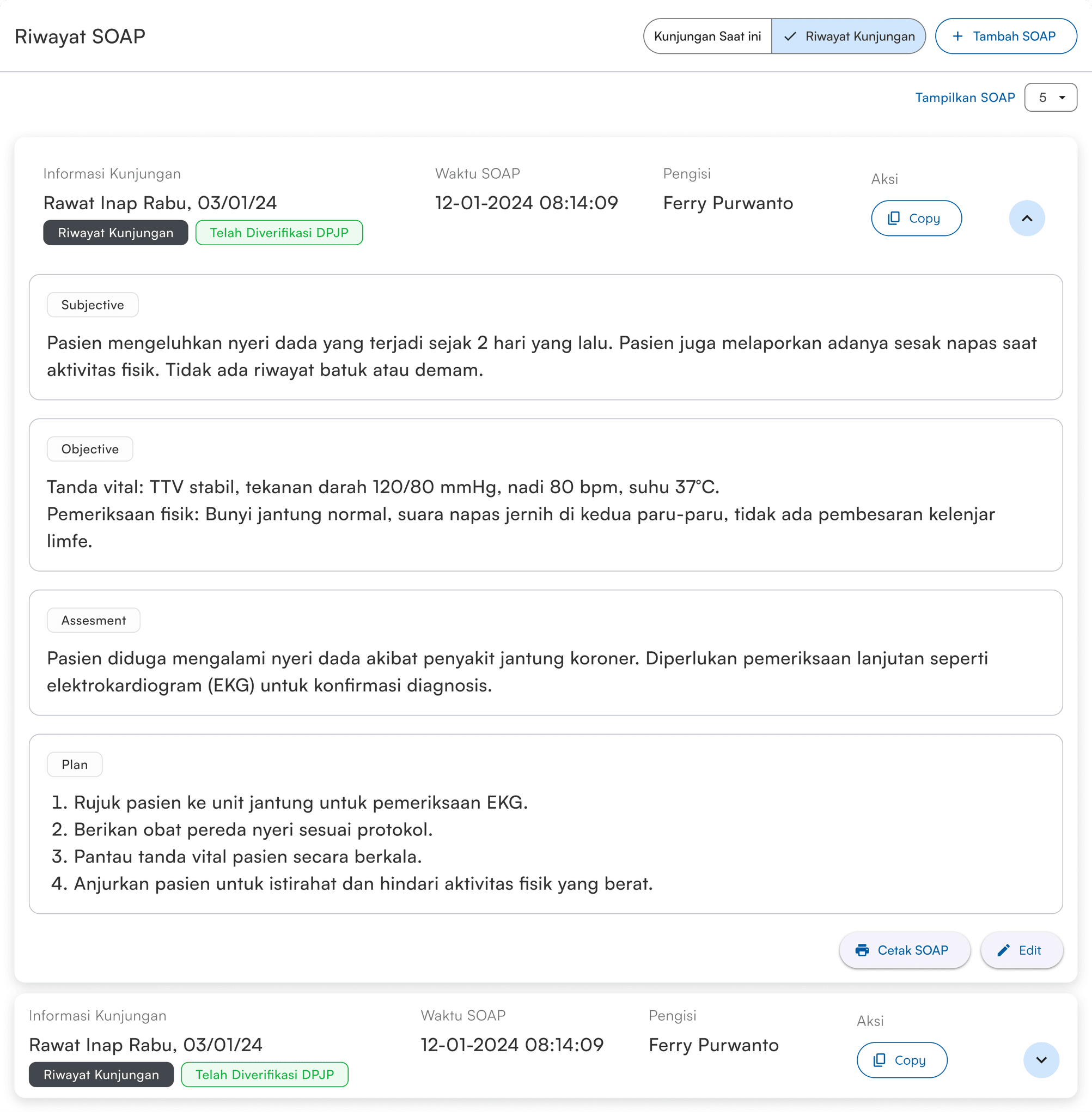
“HMW helps users in finding a good inspection history?”
For this SOAP History design, its function is to make it easy for the Doctor to read the Examination that the patient has done before. If the patient's SOAP result is the same as the previous one, then the doctor does not need to make it from scratch, just do a COPY of the Examination.
"...The features are already good for us to use, we just need to use them directly"
Tenaga medis RS Cepoko
“...The visit information and SOAP results are easy to read and there is also a Doctor verification feature.”
Tenaga medis RS Cepoko
“...Honestly, the features are very easy to use and the appearance is also simple”
Tenaga medis RST Tentara
“...if given a rating for the inspection feature 90/100, then the features are complete.”
Tenaga medis RST Tentara
“...Compared to the previous SIMRS, MedMinutes is much easier to understand, but because we are not used to using it, we need to learn all the features.”
Tenaga medis Klinik Graha Syifa
“...To make it easier for everyone to examine patients without any obstacles.”
Tenaga medis Klinik Graha Syifa
LESSON LEARNED
It is important to understand the pain points that users experience. In this process, I interview users to validate our initial hypothesis. So that the design created can provide the best solution and get a positive response from users.
And most proudly able to communicate directly with Medical Personnel (Doctors and Nurses), I also learned to communicate with Stakeholders such as the Engineer Team and Co-Founder.
BEFORE DESIGN FINAL
AFTER DESIGN FINAL